The Magic of Colors: How to Choose Palettes that Enhance the Sense of Space in Minimalist Environments
Unlocking the Power of Color in Minimalism
Color is more than just a visual element; it shapes our perception of space and influences our emotions. In minimalist environments, the right color palette can create an illusion of openness and calm while enhancing the overall aesthetic. This makes understanding color choices particularly crucial for interior design enthusiasts and homeowners alike.
The Impact of Colors in Minimalism
Choosing a color palette involves deliberate thought and understanding of the effects colors have on space. Consider these aspects:
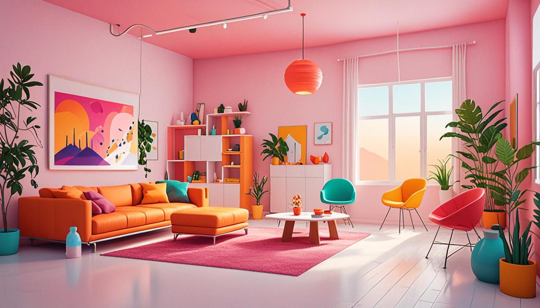
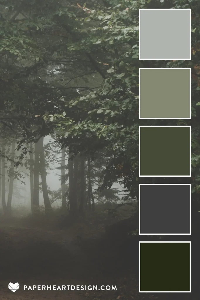
- Light vs. Dark: Lighter hues such as whites, soft beiges, and pastels can often make a space feel larger and more airy. This is especially useful in smaller rooms where creating an illusion of space is vital. On the other hand, darker shades like charcoal, navy, or forest green can add depth and create a cozy ambiance, which is appealing in larger open spaces.
- Warm vs. Cool: Warm colors, including reds, oranges, and yellows, are known to elicit feelings of warmth and inviting energy, making them suitable for communal areas like living rooms or dining spaces. In contrast, cool colors such as blues and greens create a sense of tranquility, perfect for bedrooms or study areas where relaxation and focus are needed.
- Accent Colors: Bold accent colors, like a bright mustard yellow or a deep teal, can draw attention and infuse energy into minimalist designs. The strategic use of an accent wall or decorative pieces can add interest to the aesthetic without overwhelming the simplicity of the overall look.
In a country as vibrant as Nigeria, incorporating local colors and textures can elevate minimalist designs. Earthy tones that reflect the rich browns of the soil or the warm oranges of the sunset create a connection to the environment. Think about integrating the vivid colors found in local art and textiles, such as the intricate patterns of Asoke or Adire, to showcase cultural identity. These elements prove that minimalism does not mean sacrificing one’s heritage; rather, it can celebrate it in a modern context.
Explore Further
As you delve deeper into the world of colors, remember that the right palette can redefine your space. By experimenting with combinations that suit both functionality and style, you can master the magic of colors to transform any minimalist setting into a sanctuary of serenity and sophistication. Engage with local artisans or explore markets to discover unique color combinations that resonate personally and culturally. Whether it’s adding a splash of vibrant green to reflect lush landscapes or integrating subtle pastels to promote peace, the options are endless. Empower yourself with knowledge about color theory and observe how subtle changes can make profound impacts in your living space.
ADDITIONAL INSIGHTS: Expand your understanding here
Understanding the Psychology of Color
Colors are not merely aesthetic choices; they possess a psychological weight that can significantly affect human behavior and emotions. In minimalist environments, where every detail matters, understanding the underlying psychology of color becomes essential. The right choices can not only enhance the sense of space but also evoke feelings that align with the intended use of each room.
Color Associations and Emotions
Each color carries its own set of associations and emotional responses, which can play a critical role in the atmosphere of a minimalist space. Here are a few color associations to consider when selecting your palette:
- White: Symbolizing purity and simplicity, white creates a blank canvas that helps other elements within the space stand out. It also reflects light, making small areas feel more expansive.
- Blue: Often linked with calmness and serenity, soft shades of blue are perfect for spaces dedicated to relaxation, such as bedrooms or reading nooks. When used thoughtfully, they can also create an illusion of greater depth.
- Green: Reminiscent of nature, green colors foster a sense of rejuvenation and tranquility. This makes it an excellent choice for spaces that need to inspire creativity or relaxation.
- Yellow: Bright and cheerful, yellow is known to stimulate energy and positivity. It is ideal for spaces like kitchens or home offices, provided it is balanced with softer tones to avoid overwhelming the senses.
In Nigeria’s rich cultural context, infusing your space with colors that resonate with local traditions can amplify the overall ambiance. Drawing inspiration from vibrant markets or local festivals can help you discover hues that tell a story of heritage while remaining minimalist at heart. For example, the vibrant greens of the lush Nigerian landscape or the warm hues of the sunsets can evoke feelings of connection and warmth, enhancing the living experience.
Creating Spatial Illusion through Color Choices
To truly maximize the sense of space in a minimalist environment, consider employing color techniques that manipulate perception:
- Monochromatic Palettes: Selecting varying shades of a single color can create depth while maintaining visual cohesion. This technique is particularly useful in uninterrupted spaces.
- Color Blocking: Using blocks of contrasting colors can define different areas within open plans without cluttering the visual space. This is effective in establishing functional zones, such as a living area from a dining area.
- Transitional Colors: Opt for colors that smoothly transition from walls to ceilings or flooring. This continuity deceives the eye into perceiving a more fluid and expansive environment.
By tapping into these strategies and understanding the impact of your color choices, you can transform your minimalist space into a serene haven that reflects personal style while enhancing the sense of openness. Whether subtly blending or boldly contrasting, the magic of colors lies at your fingertips, waiting to be explored.
The Magic of Colors: How to Choose Palettes that Enhance the Sense of Space in Minimalist Environments
In minimalist design, the right color palette plays a crucial role in shaping the perception of space. Not only does it create an aura of tranquility and simplicity, but it also influences mood and functionality within a room. By carefully selecting colors, you can evoke deeper emotional responses and even manipulate the space visually. Here, we delve into the specific aspects of color choices that can benefit minimalist environments.
| Color Category | Impact on Space |
|---|---|
| Neutral Hues | Create a calm, expansive atmosphere, making spaces feel larger. |
| Accent Colors | Draw attention to focal points and add personality without overwhelming the design. |
Neutral hues such as whites, grays, and beiges are fundamental in minimalist design as they expand perceived space and create a peaceful backdrop. These colors can unify different elements of a room, providing a seamless flow that enhances the overall aesthetic. On the other hand, accent colors like deep blues or vibrant greens can introduce energy into the space and highlight specific features. By using these palettes wisely, you can create an inviting yet uncluttered environment that feels both spacious and comforting.
Moreover, the lighting in minimalist spaces can drastically alter the appearance of colors used. Natural light can enhance the brightness and vibrancy, while artificial light can create different moods depending on its temperature. Using a palette that complements the natural lighting conditions in your space is essential. Understanding the interplay of color and light can take your minimalist design to new heights, bringing forth a magical play of shades that enriches your living experience.
SEE ALSO: Click here to read another article
Practical Tips for Implementing Color in Minimalist Designs
Choosing the right color palette for a minimalist environment is both an art and a science, requiring careful consideration of spatial dynamics and personal preferences. Here are some practical tips to ensure your color choices enhance the overall sense of space while maintaining the minimalist ethos.
Focus on Natural Light
One of the most crucial elements to consider when selecting colors in a minimalist space is natural light. The way light interacts with colors throughout the day can dramatically alter the perception of a room. For instance, airy spaces flooded with sunlight can handle warmer tones, such as soft peaches or soft whites, lending a vibrant yet subtle energy. In contrast, rooms that receive limited light might benefit from cooler, brighter shades like pastel blues or greens, which can create an illusion of openness and serenity.
Textures and Finishes Matter
The choice of colors should harmonize with the textures and finishes of your furniture and decor. For minimalist environments, where simplicity reigns supreme, opting for matte finishes can soften colors, making them more inviting rather than harsh. Consider how the texture of various materials interacts with color: a matte white wall contrasted with a glossy black table creates a dynamic interplay, drawing attention without cluttering the visual space.
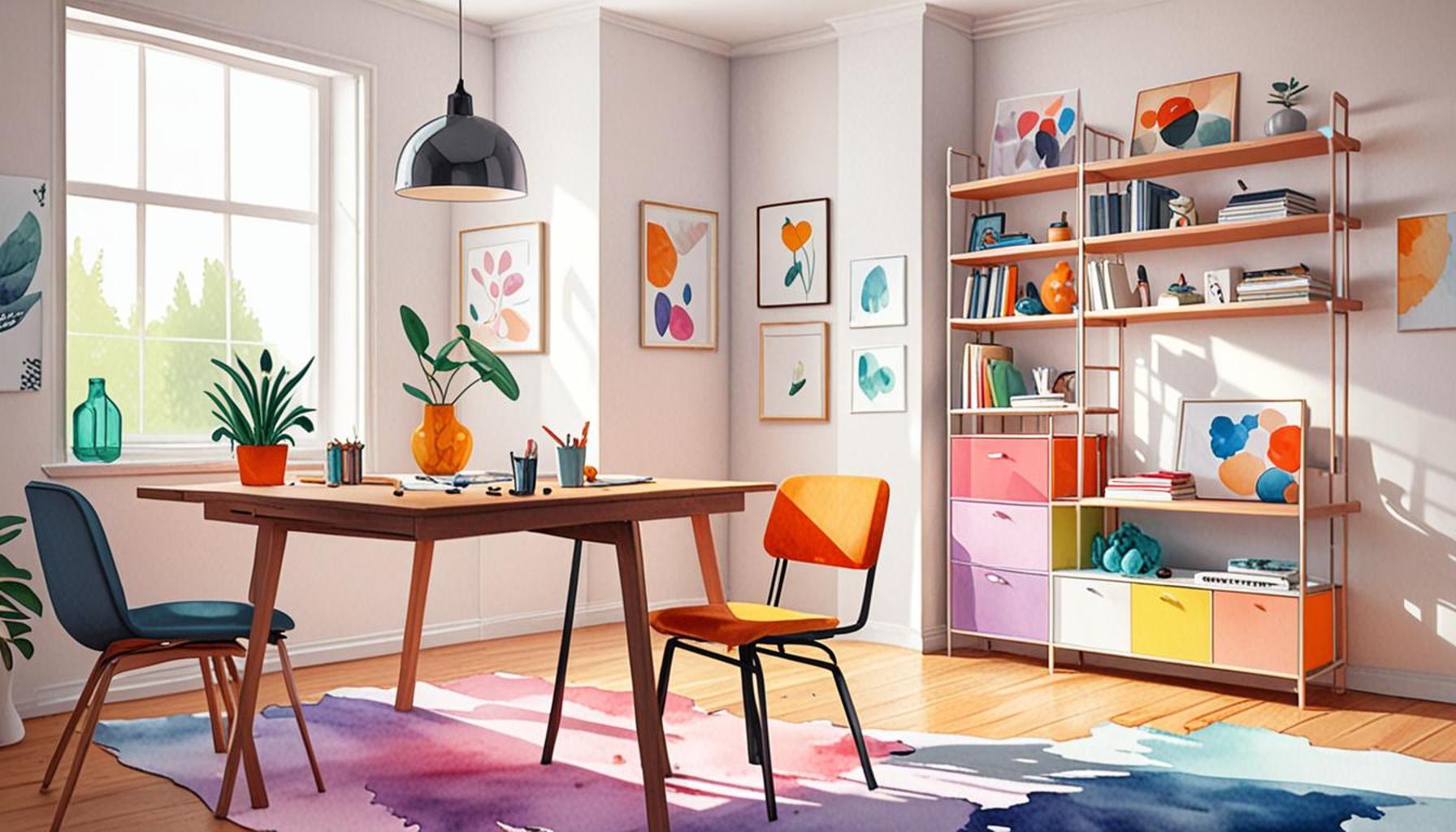
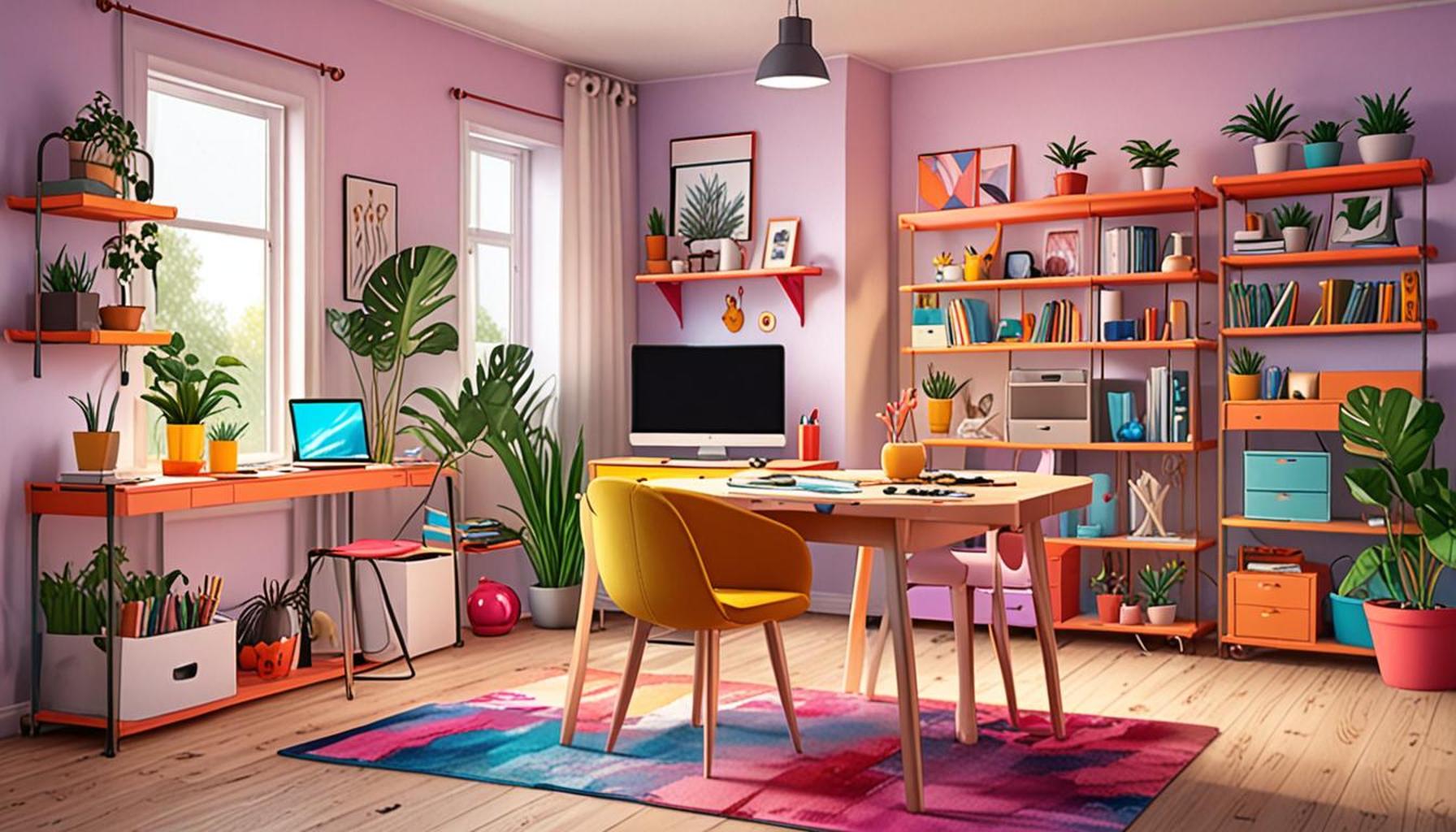
Accent Colors as Design Tools
Integrating accent colors into a minimalist palette can add depth and character without overwhelming the senses. Accents can take the form of decorative elements such as throw pillows, rugs, or artwork. For instance, a room predominantly painted in cool tones can be invigorated with a splash of vibrant orange or deep burgundy accents, creating an interesting focal point. This strategy not only brightens the area but can also subtly guide movement and attention within the space. In Nigerian interiors, inspiration can be drawn from local textiles, which often incorporate vibrant colors that tell a story, bringing an authentic cultural touch.
Seasonal Variability and Adaptability
Seasonal color shifts can further enhance the adaptability of a minimalist space. Utilizing temporary decorative elements like seasonal plants or changing throw blankets adds both color and versatility. A neutral base allows you to easily incorporate seasonal hues, from rich earth tones in the dry season to fresher colors in the wet season, allowing your space to feel alive and ever-evolving.
Community and Cultural Significance
In Nigeria, colors hold immense cultural significance. For instance, the use of traditional patterns blending with minimalist colors can create a unique aesthetic that speaks to heritage. Incorporating local artisans’ works, such as baskets or sculptures in muted tones, ties the color scheme to cultural identity while enhancing the overall environment’s sense of space. This approach not only supports local artisans but also fosters a connection between the minimalist ethos and the vibrant Nigerian culture.
In conclusion, the ability to choose colors that elevate the sense of space in minimalist environments rests on understanding the interplay of light, texture, and cultural significance. These aspects work together, allowing for a space that feels expansive, inviting, and personally resonant. By exploring these practical tips, you’ll find that the magic of colors can indeed transform even the simplest of spaces into something extraordinary.
CHECK OUT: Click here to explore more
Conclusion
In the intricate dance of design, the choice of color palette in minimalist environments emerges as a powerful tool that shapes perception, emotion, and functionality. By harnessing the transformative potential of colors, we can elevate ordinary spaces into extraordinary realms that inspire and soothe the senses. The interplay of natural light and carefully selected hues offers an opportunity to manipulate spatial dynamics and create a feeling of boundless openness. Moreover, integrating textures and finishes allows for a harmonious cohesion that enhances visual interest without detracting from the simplicity that defines minimalism.
Incorporating accent colors acts as a catalyst for creativity, as these vibrant touches offer depth and focal points that invite exploration within a space. Additionally, embracing the seasonal variability of colors not only keeps environments fresh and engaging but also resonates with the ever-changing rhythm of nature. Importantly, acknowledging the cultural significance of colors, especially within the rich tapestry of Nigerian heritage, enriches the narrative of a space and creates an organic connection to community and identity.
Ultimately, the magic of colors lies in their ability to tell stories, evoke emotions, and transform spaces. By applying the insights gleaned from this exploration, one can unlock the potential of minimalist design, crafting environments that are not just seen, but felt. As you embark on your own design journey, remember that the right palette can enhance the sense of space, inviting both tranquility and inspiration into your minimalist sanctuary.